As an analytics consulting firm for 80% of Australia’s largest nonprofits, Pareto Fundraising collects a wealth of information about the fundraising trends and behavior. Every year, the organization draws from a range of data sources to compile a State of Donation Report to educate the general public and empower strategic decision-makers.
The role that visual content plays in this process is mission-critical. Analyzing a wealth of information, Pareto creates a 300-page report that is rich with trend data. Data visualization helps the firm communicate complex information quickly, reach a wider audience, and showcase its work to potential clients.
Recently, Pareto was invited to Australia’s national fundraising conference to give an overview of donor activity within the sector.
“We really wanted to show that we were able to represent our data in the most contemporary way,” says Clarke Vincent, head of marketing and business development at Pareto Fundraising.
Here are the steps that he took to craft a highly engaging, captivating, and human presentation.
Broaden Your Expertise
Vincent describes Pareto as having an office full of data geeks. Founded by two mathematicians, the company has developed an innovative, quantitative approach to surfacing untold stories in the fundraising sector.
“We have access to entire databases for our country’s largest charities and regularly analyze hundreds of millions of dollars in transactional data,” says Vincent. “We get huge amounts of market information that inform the strategic advice that we give, and we love sharing it.”
Pareto conducts the bulk of its analysis heavy statistical research using software like R. While this tool is powerful, its data visualization capabilities are basic at best—to leave a lasting impression and tell the most compelling possible story, Vincent knew that Pareto would need to work with the smartest minds in design.
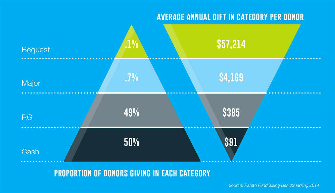
From Pareto’s State of the Donation 2015.
“I’ve been aware of Visually as a leader in the data visualization and infographic space for years,” says Vincent. “We needed a partner that was on par with our award-winning, internal creative design team. Visually was the first place where we turned.”
Be Open to New Ideas
Pareto is an organization that is known for its statistical expertise. But Vincent was worried that this wisdom would interfere with the full creative potential of the State of Donation Report.
“I had a strong idea of what we needed, but I wanted to keep our project brief open,” says Vincent. “I wanted to learn and invest in my own knowledge—I also wanted to gather more ideas, beyond my own knowledge. I saw my ideas as the default, the backstop, what could happen if there was no better way of doing it. We ended up using a few of my own ideas, if any.”
For one, Vincent originally thought about creating a one-page infographic. After diving into the data, however, the creative team realized that the project would need a shift in direction.
“We were presenting this on stage in front of probably 400 to 500 people, at a conference,” says Vincent. “And, it became pretty apparent, quite quickly, that going with a presentation format was a much better approach than trying to wedge it all into one infographic.”